Cant see progress anymore. Its almost as if you need an art mentor, right? Before you move that direction, you might want to read this guide over.
In this guide, I have compiled some basic things I learnt overtime when it comes to realistic drawings and artwork. I wrote this article for anyone who is struggling to find ways to improve their drawing skills.
Here, I help you to understand some basic composition and visual art concepts that quite a few new artists unintentionally ignore. Read the article below to make your drawings look professional and realistic.
Now, if you are wondering what are drawing fundamentals, let me elaborate here.
Drawing fundamentals are formative principles and elements of visual art that make up a full composition. In other words, drawing fundamentals are to a composition as alphabets are to a language. To understand and master a language, you need to learn alphabets/basis of that language first. That is why drawing fundamentals are a must to learn.
Principles of visual art include Balance, Contrast, Proximity, Emphasis, Rhythm, and Unity. These may differ acrosss various art disciplines but are very similar and closely connected. Pay extra attention to Balance, Contrast, and Emphasis; these can make or break your composition.
Balance is mainly of two types symmetrical and assymmetrical. When you choose to place your subject(s) in line with your grid, you are using symmetrical balance. For example, all your composition is aligned in a way that when you divide your composition in half, both sides are mirrored.
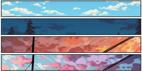
On the other hand, if you align your composition out of the grid flow and place your subject randomly, you are using assymmetrical balance, sometimes referred to as dynamic balance (see example below).
Contrast and Emphasis also play a major hand in developing an interesting and dynamic piece of artwork. Using contrasting color or gradations where needed can instantly improve your artwork, but if not handled properly, it can also have the reverse effect.
Emphasis refers to making a particular portion of your artwork more dominant than others to make it stand out more. This is widely used in art disciplines like animation, photography, and Graphic Design.
This effect can be achieved by various techniques like using a distinct color on the focus area than the rest of your composition or making the focus area larger; this way your viewer’s eye is drawn to see that area in focus first. You can read about all of theses principles in details at Wikipedia.
It is also equally important to learn and practice use of elements of art, namely; Line, Shape, Color, Value, Form, Texture, and Space. These are the building blocks of any art discipline.
How do these make a difference? Using art elements and principles together, you can make better judgements while deciding your art concept. For instance, how do you want to capture your viewer’s eye may be dependent on the amount of negative space you use or on how saturated your colors are.
It may also depend on how contrasting textures are across your composition. I have also attached a visual example below to help you understand this better.
One main issue I find with beginning artists is not understanding proportions in their drawings. This can impact any kind of composition negatively. Incorrect proportions can make a drawing seem unprofessional.
To improve proportions, first off, simplify drawing subject or objects into simple geometric shapes. This way you understand the basic structure of that object/subject and adding details becomes easier. Read more on simplification here.
If it is a portrait or a figure drawing, learning muscle formation will go a long way and largely improve your human/wildlife drawings. Here is an example of a portrait drawing that lacks proportion compared to one that is more proportionate.
Need more in-depth guidance on proportions? Read my Drawing with Proportions article! This will get you all set with drawing accurately.
You can also test if your drawing is proportionate. There is just a very simple trick to check if your drawing is distorted or not. If you have a phone with a camera, just click a picture of your work in progress. Try to keep it as close to 90 degree angle as possible so that you click a straight picture. This lets you take a step back and look at your overall artwork. If you don’t have a phone, place your artwork far away and take a look at it. If something is disproportionate, you will notice it better.
Some other tricks include taking a well needed break, and relax; and asking for feedback from others. You will feel refreshed which will in turn help you see your work with a fresh pair of eyes. This way you can point out errors easier than when you are tired. You can also ask your friends or other artists you are connected with for feedback.
When you ask for opinions from others, remember to take criticism constructively and not personally. Use criticism the best way you can to improve your work.
Being able to choose what shading techniques works for what art style is bound to make a positive impact on your artwork. There’s no wrong or right in this so experiment and find what works for your style.
I am actually going to use a reference to explain this further. Here, I am going to use examples of textures around us. To capture the texture of your subject/object, it is important to know what shading technique will represent it best.
For example, for a smooth texture like a silk cloth, blending will work best. You can use a stump to achieve this or a cotton swab. If you want to shade texture of a denim, contouring and hatching would be more ideal. To get the best output, you may need to use a combination of techniques.
After practising a few times, this will come naturally. You will know which technique will work best for a certain texture.
How do you improve strokes? Well, look at the drawing below, notice how the drawing is basically made up of really thick strokes all over (left side).
Now, see this drawing (right side) which varies stroke thickness, same flower but looks so much better. Right?
What beginners tend to do is they draw very thick lines without varying the intensity and thickness where it is needed. Strokes when used effectively can improve your drawings significantly. Here is another example of a drawing that looks completely different after varying strokes where needed.
Now, why do we draw like this? This stems from the fact that since childhood, we are taught to write using our wrist movements instead of shoulders. This affects the strokes we draw. However, if we use our shoulders, we can draw bigger and softer as we can reach more drawing area and can control pencil pressure easily.
There are a few ways to break this habit. The one that worked really well for me was drawing circles. Take a paper and draw big circles or really long lines on it but make sure to involve your shoulders, not your wrist so much. Draw as many as you can and practice this for a couple minutes regularly.
Noticed how actual mannequins are made up of cylinderical and spherical blocks/shapes? That is exactly what Mannequinization is. You simplify your subject into easy geometric shapes.
Mannequinization makes the process of shading and lighting easier as evaluating tonal values (highlights, shadows, and midtones) on these shapes is easier than on a complex object/subject.
Especially in figure drawing, this is a very important concept to ace. With Mannequinization, adding volume to your figure drawings and bringing out details in your drawing becomes way faster than using only gesture lines. This also helps you remember joints on our body quicker.
This is not only for portraits and figures, you can use this for your still life drawings as well. If you need in-depth guidance on simplifying still life, then read my article on Simplification.
This point is for those who are interested in improving their still life or cityscapes or landscape drawing skills (or similar). Understanding perspective for these type of drawings is extremely useful and will definitely improve your drawing skills.
Without proper perspective knowledge, even drawing of a simple building can look distorted, even if you use a ruler. Once you learn how perspective works, your technical drawings will start to look a lot more professional and will have more depth.
There are some concepts you need to learn when it comes to perspective like horizon, and point of view. For the start, try drawing using 1 point perspective and then once you think you have understood its use, move on to 2 point perspective, and 3 point perspective. Stay tuned for a new in-depth article on this!
Another thing I would like to mention is that there are different views you should know about too. Views like bird eye views, insect eye views, isometric views and orthographic views are vital in implemeting perspective.
Sometimes, bigger or complex drawings become really lengthy and naturally, we end up feeling impatient and frustrated; that piece just takes too long to finish. Right? This is when we just want to get it done and we end up with an unpolished work.
The best way to handle such artwork is to divide it into portions. Every composition will have at least 2 elements: subject, and background (and in some cases foreground). Instead of trying to tackle everything at once, try creating one of these first and then move to the next.
You can even further divide into smaller chunks if needed. Now, there is no rule as to what to draw first, I have always drawn my background first thing and then I make by subject. At the end, I add my foreground.
The point of this is having small manageable parts to work with instead of a large composition top to bottom.
This is the king of all tips; keep calm and keep creating artwork. This is not a race, just take your time and practice everyday. Slowly and steadily, you will get there 🙂
If you draw hastily, you will end up making small mistakes which end up reducing quality of your work. When you draw slowly, you automatically follow a rhythm, and pay constant attention to your composition.
Be positive and work towards that end result. Always be proud of your work!
Dream Big! Dream Impossible! and it will someday become possible!
Share this article: